
Excel Tutorial: Building Your First Radar Chart From Scratch

Excel Tutorial: Building Your First Radar Chart From Scratch
Quick Links
A radar chart compares the values of three or more variables relative to a central point. It’s useful when you cannot directly compare the variables and is especially great for visualizing performance analysis or survey data.
Here’s a sample radar chart, so you can see what we’re talking about. It’s likely you’ve run across them before, even if you didn’t know that’s what they were.
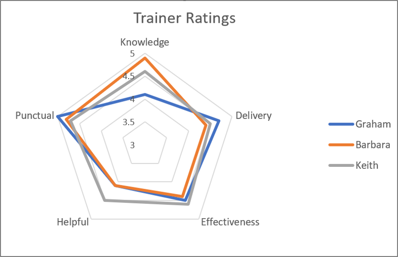
Creating Radar Charts in Excel is straightforward. In this article, we’ll show you how to create two types of Radar Chart: a regular chart (like the one above) and a filled chart (like the one below, which fills in the areas instead of just showing the outlines).

The Sample Data
Let’s first take a look at the sample data we’ll be using for our examples.
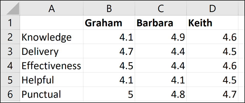
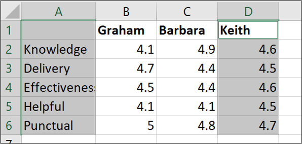
We have three trainers: Graham, Barbara, and Keith. We’ve assessed them in five different categories (Knowledge, Delivery, and so on) and our Excel table contains those ratings.
Create a Radar Chart in Excel
In this first example, we will create a Radar Chart that shows the assessment of all three trainers.
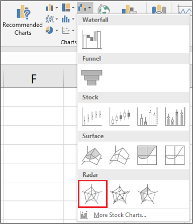
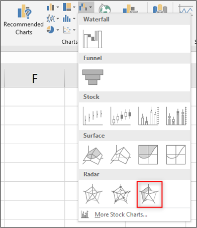
Select all the cells, including the row that contains the names and the column that contains the assessment titles. Switch to the “Insert” tab and then click the “Waterfall Chart” button.
You can choose from three Radar Charts from which to pick. Choose the first Radar Chart option for this example. (The second option just adds markers to the values on the lines; the third option fills the chart, and we’ll be looking at that one a bit later.)
Now that you’ve inserted the chart into the worksheet, you can begin to make some improvements to it.
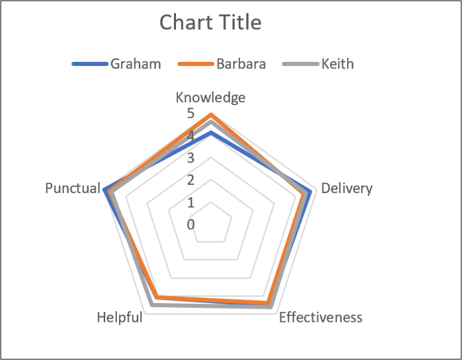
Enter a Chart Title
Select the chart title and then type a new title. As you type, the text will appear in the Formula Bar.
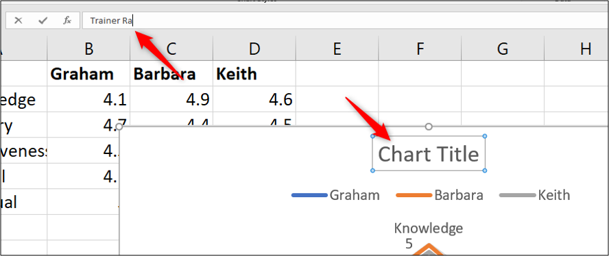
When you press Enter, your chart will have a new title.

Move the Legend
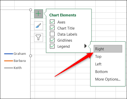
For another change, we could move the legend from above the chart to the right.
When the chart is selected, you’ll see four buttons hovering at its top right. Click the “Chart Elements” button at the top, and then hover your mouse over the “Legend” option. You’ll see an arrow to the right. Click that and then click the “Right” option on the menu that appears.
Modify the Radar Chart Axis
To give our Radar chart a greater impact, and more data clarity, we will modify the axis to begin at three instead of zero.
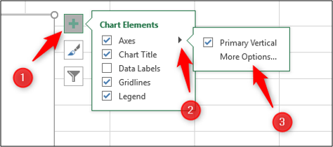
Click the “Chart Elements” button again, hover over the “Axes” option, click the arrow that appears next to it, and then select “More Options.”
The Format Axis pane appears on the right. We want to edit the “Minimum” setting under the “Bounds” section, so click that field and type “3” there.
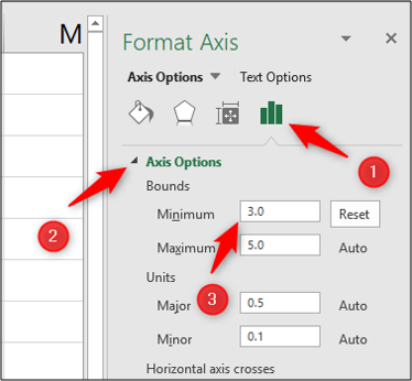
The radar chart updates immediately and now that we’ve increased the minimum Bounds value, you can more clearly see the differences in the assessments of the three trainers.

This example gives us a nice view of which trainers excel at which qualities, and also how rounded their skill sets are.
Create a Filled Radar Chart
For a second example, we will create a filled radar chart for just one of the trainers. We will use Keith for this example.
First, select the range of cells that you need. In our example, we want the range
`A1:A6`
and the range
`D1:D6`
as shown below. To do this, hold the Ctrl key while you select each additional cell you want to add to your selection.
Now head to Insert > Waterfall Chart > Filled Radar.
When you create a radar chart using only one data series, the axis does not start from zero the way it did in our previous example. Instead, the minimum bound will be the lowest number in the range of cells you selected. In our case, the minimum bound is 4.4—one tick below Keith’s minimum score.

This chart helps you visualize how strong Keith is in each of the assessed qualities.
Note that if we were creating more than one radar chart (like, say, we wanted to show a separate chart for each of our trainers), we would want to make sure the axis ranges are consistent so that the data presentation is not misleading. So, for example, we would set the minimum bound to be a bit below the lowest ranking of any trainer and the maximum bound to be a bit higher than the highest ranking of any trainer. You could even remove the axis itself to reduce clutter on the chart.
Creating radar charts in Excel is simple, but getting the most out of them can require some extra attention. They can be a useful addition to your Excel reports in the future.
Also read:
- [Updated] 2024 Approved Essential Steps to Implement Video Card Anchors on YouTube
- 2024 Approved Essential Tips for Film Saving and Trimming in Adobe Connect
- Controlling Clock/Date Visibility in Windows 11 Bar
- Decoding the Best Moments for Running Ping Commands
- Guía Paso a Paso Para Hacer Respaldo De La Configuración De Windows (VHD) en Versiones 11, 8 Y 7
- How to Fix Pokemon Go Route Not Working On OnePlus Nord N30 5G? | Dr.fone
- How to Fix the Operation Failed 0X0000011B Error on Windows 11 & 11
- How to Restore iPhone 12 Pro from Backup when iTunes Backup is Corrupt or not compatible | Stellar
- Improving Device Linking Performance with Reduced RAM Consumption
- In 2024, Additional Tips About Sinnoh Stone For Tecno Pova 5 Pro | Dr.fone
- Reset Your Shortcuts!: Strategies to Restore Functionality to Windows Input Methods
- Resolving Windows Update Error: Code 0xCA00A009
- Reviewing Changes in the Sony S6500 Blu-Ray System
- Skyrim's Extender Errors on Your System
- Top-Rated Metallic Seekers : Industry Experts' Choice - ZDNet
- Win 11 Store Repair Guide to Eliminate Error Code X00000000
- Win Over Xbox Woes on Your Windows Machine
- Title: Excel Tutorial: Building Your First Radar Chart From Scratch
- Author: Richard
- Created at : 2024-12-01 18:43:02
- Updated at : 2024-12-06 20:42:09
- Link: https://win11-tips.techidaily.com/excel-tutorial-building-your-first-radar-chart-from-scratch/
- License: This work is licensed under CC BY-NC-SA 4.0.