
Mastering Chart Selection with Filters in MS Excel: Tips & Tricks

Mastering Chart Selection with Filters in MS Excel: Tips & Tricks
Quick Links
Graphs and charts give you an easy way to display data at a glance. But what if you want to focus on a particular part of your chart? By applying a filter to an Excel chart, you can emphasize specific data.
With Microsoft Excel on Windows, you can quickly filter your chart data using a handy button. Excel on Mac doesn’t currently offer this feature, but you can still apply a filter to the data which updates the chart. Let’s look at both!
Filter a Chart in Excel on Windows
You can certainly use Excel’s data filter on the Home tab. But Microsoft makes applying a filter to a chart a bit simpler on Windows.
Select the chart and you’ll see buttons display to the right. Click the Chart Filters button (funnel icon).
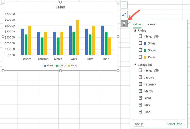
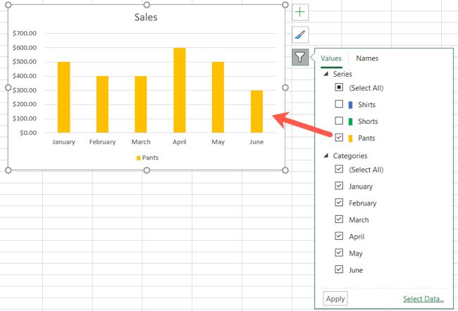
When the filter box opens, select the Values tab at the top. You can then expand and filter by Series, Categories, or both. Simply check the options you want to view on the chart, then click “Apply.”
Note that some chart types don’t offer the Chart Filters option such as Pareto , Histogram , and Waterfall charts. You can still filter the chart by applying a filter to the data instead. Follow the steps below for filtering a chart on Mac as the steps are the same in Excel on Windows.
Remove a Filter
When you finish using the Chart Filters, click that button once more to open the filter box. Check the boxes for Select All in Series or Categories, depending on the filter you used. Then, click “Apply.”
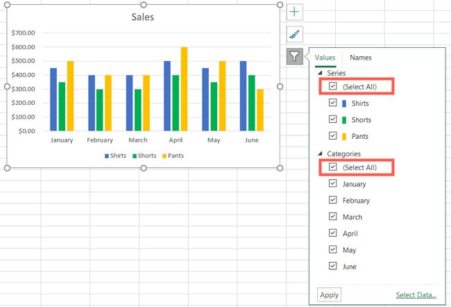
Your chart should then be back to its original view.
Filter a Chart in Excel on Mac
Since there isn’t a Chart Filters button next to a chart you create in Excel on Mac, you’ll need to use the data filter on the Home tab.
Related: How to Create and Customize a Funnel Chart in Microsoft Excel
Select the data for your chart, not the chart itself. Go to the Home tab, click the Sort & Filter drop-down arrow in the ribbon, and choose “Filter.”
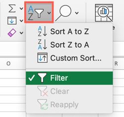
Click the arrow at the top of the column for the chart data you want to filter. Use the Filter section of the pop-up box to filter by color, condition, or value.
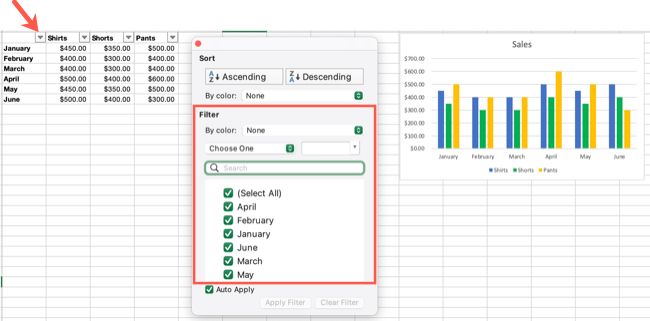
When you finish, click “Apply Filter” or check the box for Auto Apply to see your chart update immediately.
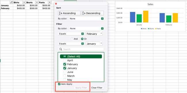
Remove a Filter
To return your chart to its original view, simply remove the filter. Click the filter button at the top of the column you filtered by and select “Clear Filter” in the pop-up box.
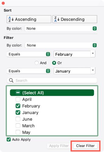
You can turn off the data filter if you like as well. Go back to the Home tab, click Sort & Filter in the ribbon, and deselect “Filter.”
Filters are not just handy for data sets, but charts as well. So remember this tip the next time you want to highlight data in a pie, column, or bar chart in Excel .
Also read:
- [New] In 2024, Mastering Minecraft's Geometric Forms Circular & Spherical Creation
- [New] Mobile Video Smoothing System Pro
- [Updated] 2024 Approved The Ultimate Blueprint for Seamless Eco-Screen Integration
- A Guide to Digital Television: How Does It Access the Internet?
- August 23Rd Edition of New York Times Connection Puzzles - Solutions & Answers #439
- Disabling Unlicensed Adobe Software Alerts
- Edge's Steady Presence: Insight for Win11 Users
- Elevate Your Brand's Visibility with These Key Marketing Practices
- Harnessing WIN11'S Sticky Features: A Multi-Device Approach
- Lost Microphone Sound? Here's the Windows Google Meet Solution
- Silent Archive Integration: Securing ZIP Within Images (Windows 11)
- Streamline Your YouTube Presence Using Premiere Pro
- Top Tips for Streamlining the Windows 11 Taskbar Experience
- Unveiling the Power of Modern Electronics at Tom's Hardware Resource Center
- Win-Friendly Guide: Convert MKV to MP4 Quickly
- Title: Mastering Chart Selection with Filters in MS Excel: Tips & Tricks
- Author: Richard
- Created at : 2024-12-05 00:44:14
- Updated at : 2024-12-06 19:08:29
- Link: https://win11-tips.techidaily.com/mastering-chart-selection-with-filters-in-ms-excel-tips-and-tricks/
- License: This work is licensed under CC BY-NC-SA 4.0.