
Mastering Trendline Analysis: A Step-by-Step Guide Using Microsoft Excel

Mastering Trendline Analysis: A Step-by-Step Guide Using Microsoft Excel
Quick Links
- Add a Trendline
- Add Trendlines to Multiple Data Series
- Format Your Trendlines
- Extend a Trendline to Forecast Future Values
- Display the R-Squared Value
You can add a trendline to a chart in Excel to show the general pattern of data over time. You can also extend trendlines to forecast future data. Excel makes it easy to do all of this.
A trendline (or line of best fit) is a straight or curved line which visualizes the general direction of the values. They’re typically used to show a trend over time.
In this article, we’ll cover how to add different trendlines, format them, and extend them for future data.
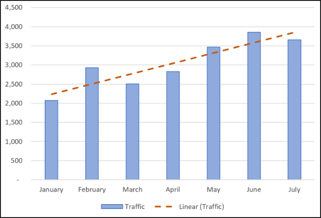
Add a Trendline
You can add a trendline to an Excel chart in just a few clicks. Let’s add a trendline to a line graph.
Select the chart, click the “Chart Elements” button, and then click the “Trendline” checkbox.
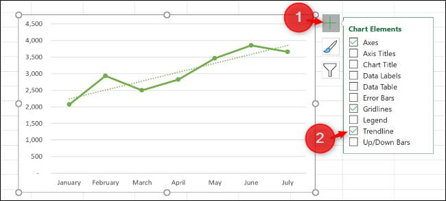
This adds the default Linear trendline to the chart.
There are different trendlines available, so it’s a good idea to choose the one that works best with the pattern of your data.
Click the arrow next to the “Trendline” option to use other trendlines , including Exponential or Moving Average.
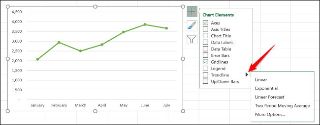
Some of the key trendline types include:
- Linear: A straight line used to show a steady rate of increase or decrease in values.
- Exponential: This trendline visualizes an increase or decrease in values at an increasingly higher rate. The line is more curved than a linear trendline.
- Logarithmic: This type is best used when the data increases or decreases quickly, and then levels out.
- Moving Average: To smooth out the fluctuations in your data and show a trend more clearly, use this type of trendline. It uses a specified number of data points (two is the default), averages them, and then uses this value as a point in the trendline.
To see the full complement of options, click “More Options.”
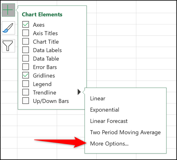
The Format Trendline pane opens and presents all trendline types and further options. We’ll explore more of these later in this article.
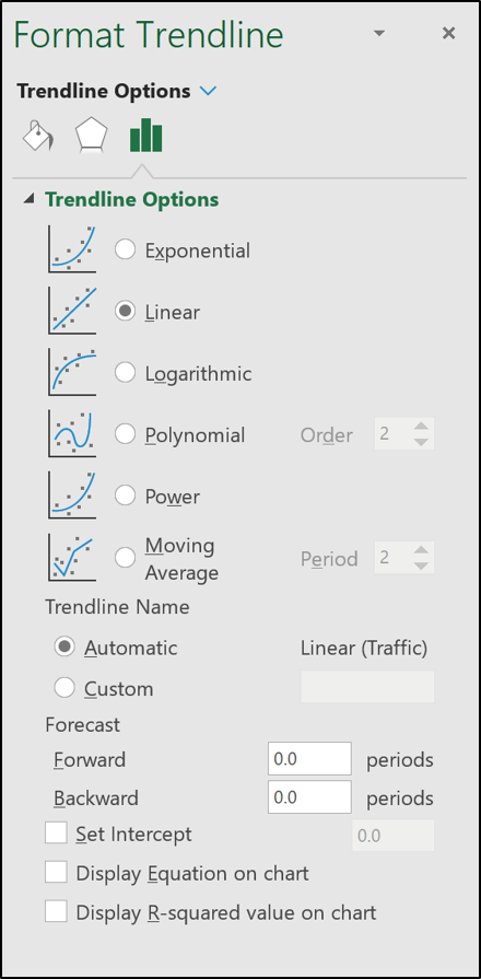
Choose the trendline you want to use from the list, and it will be added to your chart.
Add Trendlines to Multiple Data Series
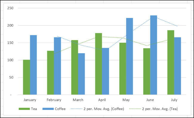
In the first example, the line graph had only one data series, but the following column chart has two.
If you want to apply a trendline to only one of the data series, right-click on the desired item. Next, select “Add Trendline” from the menu.
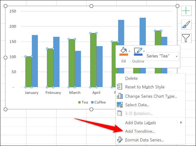
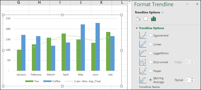
The Format Trendline pane opens so you can select the trendline you want.
In this example, a Moving Average trendline has been added to the charts Tea data series.
If you click the “Chart Elements” button to add a trendline without selecting a data series first, Excel asks you to which data series you want to add the trendline.
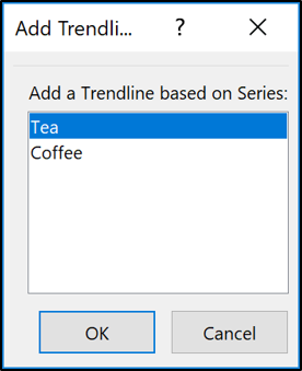
You can add a trendline to multiple data series.
In the following image, a trendline has been added to the Tea and Coffee data series.
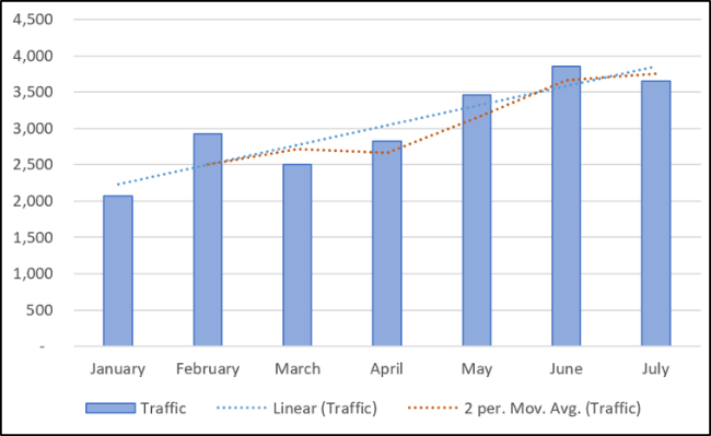
You can also add different trendlines to the same data series.
In this example, Linear and Moving Average trendlines have been added to the chart.
Format Your Trendlines
Trendlines are added as a dashed line and match the color of the data series to which they’re assigned. You might want to format the trendline differently—especially if you have multiple trendlines on a chart.
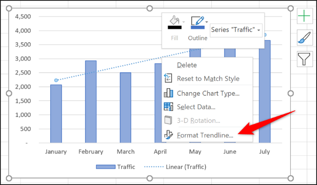
Open the Format Trendline pane by either double-clicking the trendline you want to format or by right-clicking and selecting “Format Trendline.”
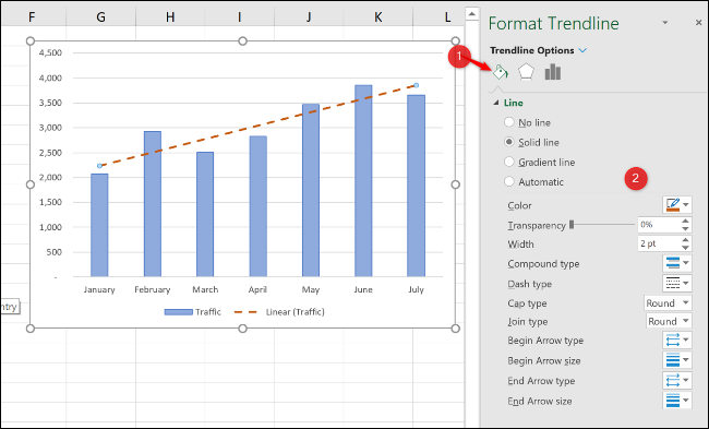
Click the Fill & Line category, and then you can select a different line color, width, dash type, and more for your trendline.
In the following example, I changed the color to orange, so it’s different from the column color. I also increased the width to 2 pts and changed the dash type.
Extend a Trendline to Forecast Future Values
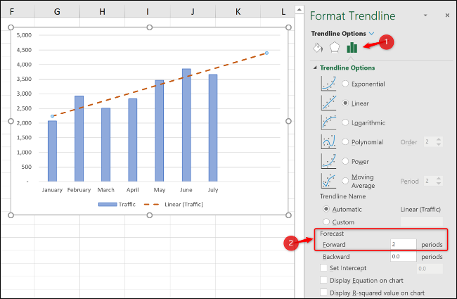
A very cool feature of trendlines in Excel is the option to extend them into the future. This gives us an idea of what future values might be based on the current data trend.
From the Format Trendline pane, click the Trendline Options category, and then type a value in the “Forward” box under “Forecast.”
Display the R-Squared Value
The R-squared value is a number that indicates how well your trendline corresponds to your data. The closer the R-squared value is to 1, the better the fit of the trendline.
From the Format Trendline pane, click the “Trendline Options” category, and then check the “Display R-squared value on chart” checkbox.
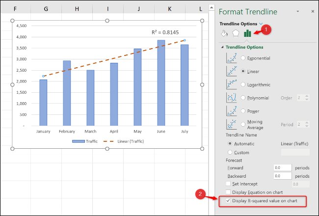
A value of 0.81 is shown. This is a reasonable fit, as a value over 0.75 is generally considered a decent one—the closer to 1, the better.
If the R-squared value is low, you can try other trendline types to see if they’re a better fit for your data.
Also read:
- [New] In 2024, Essential Guide for the Finest Travel Movie Tools
- [New] In-Game Recorder Faceoff for 2024
- [New] Top 5 Low-Cost Pinterest Video Download Software
- [Updated] In 2024, Simplicity in Pc Audio Capture Choose X-Recorder
- 2024 Approved Orchestrating Pictures with Musical Accompaniment
- Customizing Text Entry Interface: Add WordPad Command Keys to Window's Menu
- Efficient Management of Revamped Widget Picker in Windows OS
- Enabling an Easier Way to Check for Windows 11 Software Updates UI-Wise
- Enhancing System Aesthetics: Affixing 'This PC' Icon
- Get to Know Your PC's RAM: Simple Windows Approach
- How to Fix Windows nX Freezing Issues During File Transfers – Expert Solutions Unveiled
- Leading Sites for 3D Type Artistry
- Quick Guide: Implementing Search in Win11 Task Manager
- Step-by-Step Tutorial on How to Use IGTV Effectively for 2024
- Your Complete Guide To Reset OnePlus Nord N30 SE | Dr.fone
- Title: Mastering Trendline Analysis: A Step-by-Step Guide Using Microsoft Excel
- Author: Richard
- Created at : 2024-12-05 02:01:37
- Updated at : 2024-12-06 16:14:29
- Link: https://win11-tips.techidaily.com/mastering-trendline-analysis-a-step-by-step-guide-using-microsoft-excel/
- License: This work is licensed under CC BY-NC-SA 4.0.