
Step-by-Step Guide: Creating a Pie Chart Using Microsoft Excel

Step-by-Step Guide: Creating a Pie Chart Using Microsoft Excel
Quick Links
Using pie charts allows you to illustrate the distribution of data in the form of slices. It’s easy to make 2D, 3D, or doughnut-style pie charts in Microsoft Excel—no design knowledge necessary! Here’s how to do it.
How to Create a Pie Chart in Excel
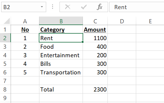
To create a pie chart in Excel, first, open your spreadsheet with the Excel app. We’ll use the following spreadsheet for this guide:
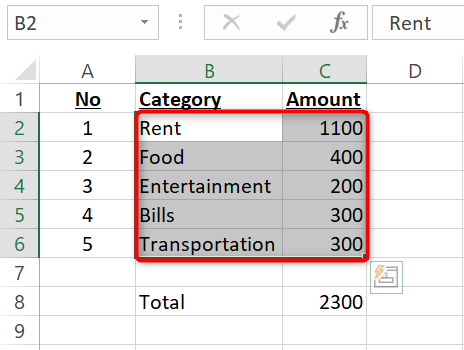
In your spreadsheet, select the data that you want to plot on your pie chart. Do not select the sum of any numbers as you probably don’t want to display it on your chart.
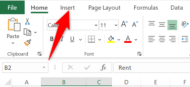
While your data is selected, in Excel’s ribbon at the top, click the “Insert” tab.
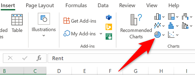
In the “Insert” tab, from the “Charts” section, select the “Insert Pie or Doughnut Chart” option (it’s shaped like a tiny pie chart).
Various pie chart options will appear.
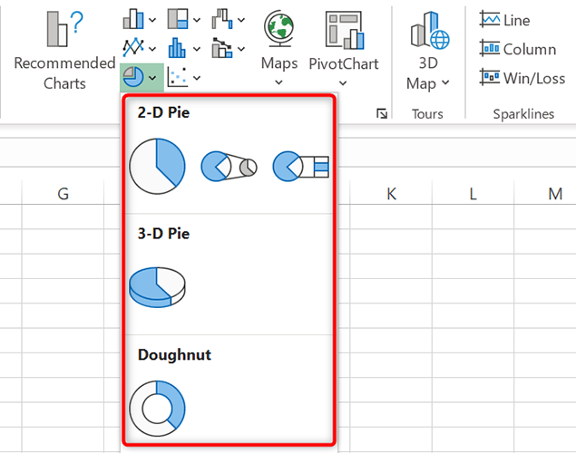
To see how a pie chart will look like for your data, hover your cursor over the chart and a preview will appear.
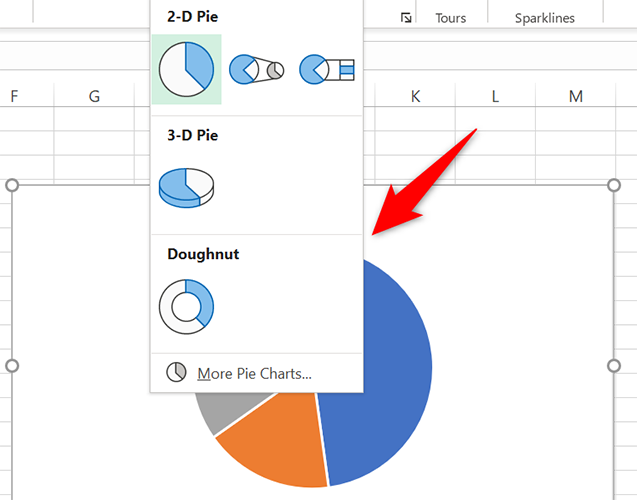
Once you decide on a chart, click that chart to add it to your spreadsheet.

The chart is now available in your spreadsheet. To change the chart’s header, double-click the header and enter a new name.
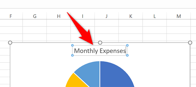
You can change the chart’s position in your spreadsheet by dragging and dropping the chart. There’s an option to lock the position of your chart as well.
And that’s how you go about displaying your Excel data using slices on a pie!
Related: How to Lock the Position of a Chart in Excel
How to Customize the Pie Chart in Excel
The default pie chart design looks good on its own, but you can customize it if you want.
To do so, click your chart so it’s selected. Then, in Excel’s ribbon at the top, click the “Chart Design” tab.
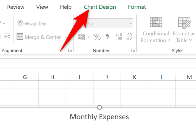
In the “Chart Design” tab, you will find various chart customization options. If you’d like to change your chart’s color scheme, click the “Change Colors” option and pick a new scheme.
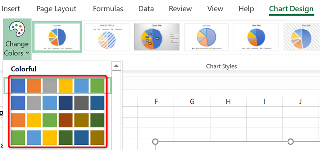
Similarly, to change your chart’s style, pick a new design from the “Chart Styles” section.

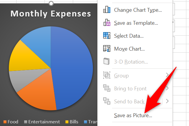
Lastly, if you want to use your chart outside of Excel, save the chart as an image file by right-clicking the chart and selecting “Save as Picture.”
And that’s how you personalize your pie charts in Microsoft Excel. If you’re creating a handout, you may want to save your Excel sheet as a PDF before printing it.
Making multiple pie charts in your spreadsheets? You can also group your charts with an Excel feature.
Related: How to Combine or Group Pie Charts in Microsoft Excel
Also read:
- [New] 2024 Approved Ultimate List of Window Screenshot Utilities
- Beat Explorers' Playlist Accessible, Free Online Tools for 2024
- Explaining and Eliminating Error Code: C0000005
- Free Film Resource Highlights Where to Start Your Search
- Ftdibus.sys Explained: Understanding Its Role in Disabling Windows Memory Integrity
- How to Reset the Mouse and Keyboard Settings to Their Defaults on Windows
- In 2024, 3 Effective Methods to Fake GPS location on Android For your Nokia C02 | Dr.fone
- In 2024, How to Watch Hulu Outside US On Motorola Moto G 5G (2023) | Dr.fone
- In 2024, Innovative 14 Animated Text Display Cases
- Innovating Window Command Set for Mythic Modifications
- Mastering the Art of Windows 11 Taskbar Visibility
- Re-Establishing Stable Win11 AnyDesk Connection
- Smoothly Switch Between WiFi and Local Networks
- Start Saving with Reddit Today - 13 Easy & Effective Strategies (No Experience) for 2024
- Tackling uTorrent Setup Failures on Latest Windows Versions
- Title: Step-by-Step Guide: Creating a Pie Chart Using Microsoft Excel
- Author: Richard
- Created at : 2024-12-04 22:53:05
- Updated at : 2024-12-06 20:03:18
- Link: https://win11-tips.techidaily.com/step-by-step-guide-creating-a-pie-chart-using-microsoft-excel/
- License: This work is licensed under CC BY-NC-SA 4.0.