
Step-by-Step Guide: Creating an Elegant Bubble Chart with Microsoft Excel

Step-by-Step Guide: Creating an Elegant Bubble Chart with Microsoft Excel
Quick Links
- Prepare the Bubble Chart Data
- Create the Bubble Chart
- Customize the Bubble Chart
- Edit the Chart Data
When you want to display three data series on a type of scatter plot, then a bubble chart is the ideal choice. We’ll show you how to organize your data and create a bubble chart in Microsoft Excel .
As a variation of the scatter chart, a bubble chart is often used to show financial data. However, you can use this style of chart for other types of data where you want to emphasize certain values as bubbles.
Prepare the Bubble Chart Data
Because Excel plots the data that you provide on the chart for you, you’ll want to be sure it’s organized correctly.
Related: How to Choose a Chart to Fit Your Data in Microsoft Excel
Here are the basics to keep in mind:
- A bubble chart does not use a category axis, but values instead.
- A bubble chart uses values for x, y, and z whereas a scatter plot uses only x and y.
- Arrange your data so that the x values are in the first row or column with the corresponding y values next and z at the end. Remember that the z values determine the sizes of the bubbles.
- Be sure that you have at least four rows or columns of data.
- Do not include row or column headers in your data selection for the chart. Otherwise, it may not display the data correctly.
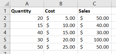
We’ll use the data below as an example for the bubble chart. You can see the x values are in column A, y values are in column B, and z values are in column C.
Create the Bubble Chart
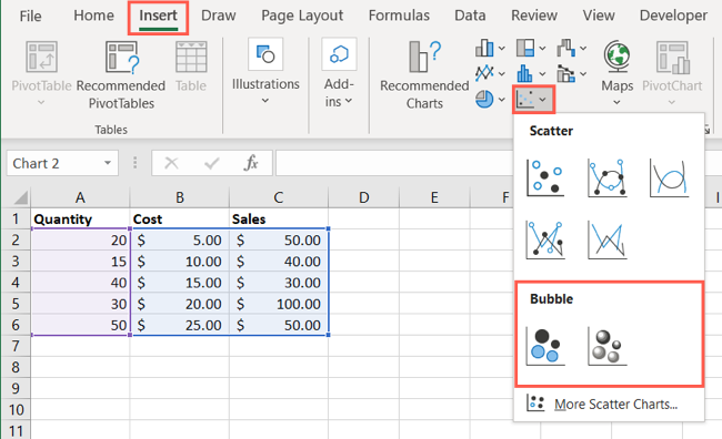
Select the data set for the chart by dragging your cursor through it. Then, go to the Insert tab and Charts section of the ribbon.
Click the Insert Scatter or Bubble Chart drop-down arrow and pick one of the Bubble chart styles at the bottom of the list.
Your chart displays in your sheet immediately. You can see our Quantity values (x) along the bottom, Cost values (y) along the left side, and Sales values (z) as the sizes of the bubbles.
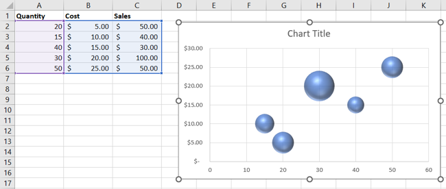
From here, you can drag to move or resize the chart, or customize it to include a trendline , legend, data labels, and more.
Customize the Bubble Chart
You have a few different ways to customize the bubble chart in Excel. Select the chart open one or more of the following views.
Related: How to Create and Customize a Waterfall Chart in Microsoft Excel
Chart Design Tab
Open the Chart Design tab to apply a different layout, pick a new style, switch the columns and rows, or add a chart element.

Format Tab
Open the Format tab to use a fill color, outline, effect, WordArt, or alt text.

Format Chart Sidebar
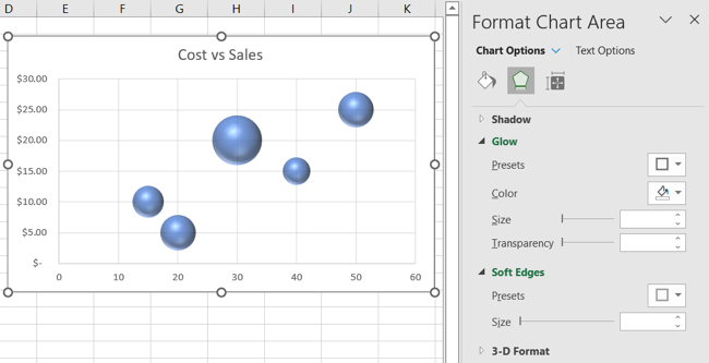
Right-click the chart and choose “Format Chart Area.” You can then do some of the same things as on the Format tab. You can add a fill or border color, apply a shadow or glow, and change the size or properties .
Related: How to Lock the Position of a Chart in Excel
Windows Chart Format Buttons
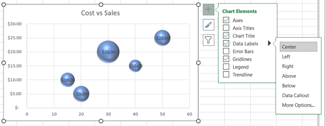
If you use Excel on Windows, you’ll also see three buttons appear on the right side of the bubble chart while it’s selected.
Chart Elements: Add, remove, or position the axis titles , error bars, data labels , gridlines, legend, and trendline.
Chart Styles: Choose a different bubble chart style or another color scheme.
Chart Filters: Filter the data on the chart by value or name.
Edit the Chart Data
If you edit or delete data for your chart, the bubble chart updates automatically. But if you add data, such as another row or column, you’ll need to adjust the data selection.
Do one of the following to include more data in the chart:
- Select the chart and then drag the outline of the data to include the new data.
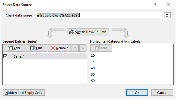
- Right-click the chart and pick “Select Data.” Adjust the Chart Data Range.
- Select the chart and click “Select Data” on the Chart Design tab. Edit the Chart Data Range.
Charts are useful and appealing visualizations of data. So, if you have a data set that a scatter plot can’t accommodate, consider a bubble chart in Excel.
For more, take a look at how to create a Pareto chart or how to make a funnel chart in Excel.
Also read:
- [New] 2024 Approved No More Glitches Working OBS Cameras
- [New] Elevate Your Team's Productivity with Slack + Filmora Harmony for 2024
- [New] Premium 8 Cam Enhancers for Clear Broadcasting
- [Updated] Leveraging Cross-Functional Collaboration for Comprehensive Market Research
- Boost Your Productivity Mastering Zoom Within the Gmail Framework for 2024
- Expert Advice on Diagnosing and Fixing Black Screens in Active Computers
- How to Fix the “This File Does Not Have an App Associated With It” Error on Windows
- In 2024, From Novice to Pro Mastering the Art of Editing via Polarr
- In 2024, How to Unlock iPhone 12 Pro Max with a Mask On
- Integrating Secret Commands Into Windows Interface
- Masterful Momentum: Essential Productivity Tools for Windows 11
- Navigating Windows VPN Troubleshooting Procedures
- Refreshing Your Digital Domain: Windows 10/11' Writers’ Toolkit Restarts
- Reviving Muted Connections: Steps to Repair HDMI No-Sound Issue Between Laptop, Monitor, and Television
- Tackling Non-Attached File Program Issue (Win 10/11)
- The Ultimate Guide: Embedding Old Apps Into the Latest Windows 11
- What Makes The Feb2023 Win11 Update Stand Out?
- Title: Step-by-Step Guide: Creating an Elegant Bubble Chart with Microsoft Excel
- Author: Richard
- Created at : 2024-12-05 18:06:48
- Updated at : 2024-12-06 20:02:27
- Link: https://win11-tips.techidaily.com/step-by-step-guide-creating-an-elegant-bubble-chart-with-microsoft-excel/
- License: This work is licensed under CC BY-NC-SA 4.0.